

Groovu
Branding Case Study
Groovu is a startup founded by forward-thinking digital marketing experts in Linz, Austria. Operating at the intersection of technology and strategy, Groovu navigates the complex world of SEO with authenticity, human-centered thinking, and a sharp focus on measurable results.
Services
Brand Strategy - Visual Identity - Name Development

Groovu
Branding Case Study
Brand Strategy - Visual Identity - Name Development
Groovu is a startup founded by forward-thinking digital marketing experts in Linz, Austria. Operating at the intersection of technology and strategy, Groovu navigates the complex world of SEO with authenticity, human-centered thinking, and a sharp focus on measurable results.
Groovu is building an innovative SEO solution aimed at eliminating the inefficiencies and guesswork that often slow down digital growth. With a vision to empower businesses through smarter, data-driven search strategies, Groovu approached Henu Design Studio to define its identity as a bold new player in the SEO space and lay the groundwork for future brand awareness and product adoption.
Groovu needed a brand identity that positioned them as emerging leaders in the SEO and digital strategy space—while staying true to their purpose-driven values of transparency, innovation, and long-term impact.


2025
Linz
SEO
Brand Attributes: Trustworthy Smart Futuristic Innovative Analytical.
Name Development
The name “Groovu” was carefully crafted to reflect the brand’s dynamic and forward-thinking spirit. It combines a modern, catchy sound with a sense of rhythm and movement—symbolizing the seamless flow of digital growth and the continuous optimization process at the heart of SEO. The name is easy to pronounce, memorable, and adaptable across various languages and markets, positioning Groovu as a growing business in the digital marketing space. This thoughtful naming approach supports the brand’s mission to simplify complex digital strategies and create an authentic connection with its audience.
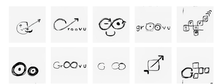
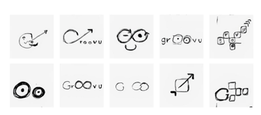
Rough Draft Sketches
Vector Draft
Groovu is building an innovative SEO solution aimed at eliminating the inefficiencies and guesswork that often slow down digital growth. With a vision to empower businesses through smarter, data-driven search strategies, Groovu approached Henu Design Studio to define its identity as a bold new player in the SEO space and lay the groundwork for future brand awareness and product adoption.
Groovu needed a brand identity that positioned them as emerging leaders in the SEO and digital strategy space—while staying true to their purpose-driven values of transparency, innovation, and long-term impact.

2025 - Linz - SEO
Brand Attributes: Trustworthy - Smart -Futuristic - Innovative - Analytical.
Name Development
The name “Groovu” was carefully crafted to reflect the brand’s dynamic and forward-thinking spirit. It combines a modern, catchy sound with a sense of rhythm and movement—symbolizing the seamless flow of digital growth and the continuous optimization process at the heart of SEO. The name is easy to pronounce, memorable, and adaptable across various languages and markets, positioning Groovu as a growing business in the digital marketing space. This thoughtful naming approach supports the brand’s mission to simplify complex digital strategies and create an authentic connection with its audience.

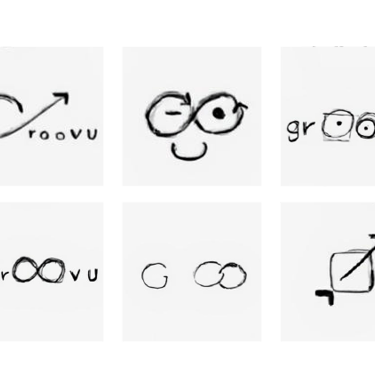
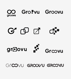

Rough Draft Sketches
Vector Draft
Challenge
Groovu faced the challenge of entering a highly competitive SEO market dominated by established players. Their core difficulty was to establish a brand identity that would communicate their innovative, transparent, and human-centered approach, differentiating them from more technical or impersonal competitors. Additionally, Groovu needed a scalable visual system that could grow with their expanding services while maintaining a consistent and memorable brand presence.
Solution
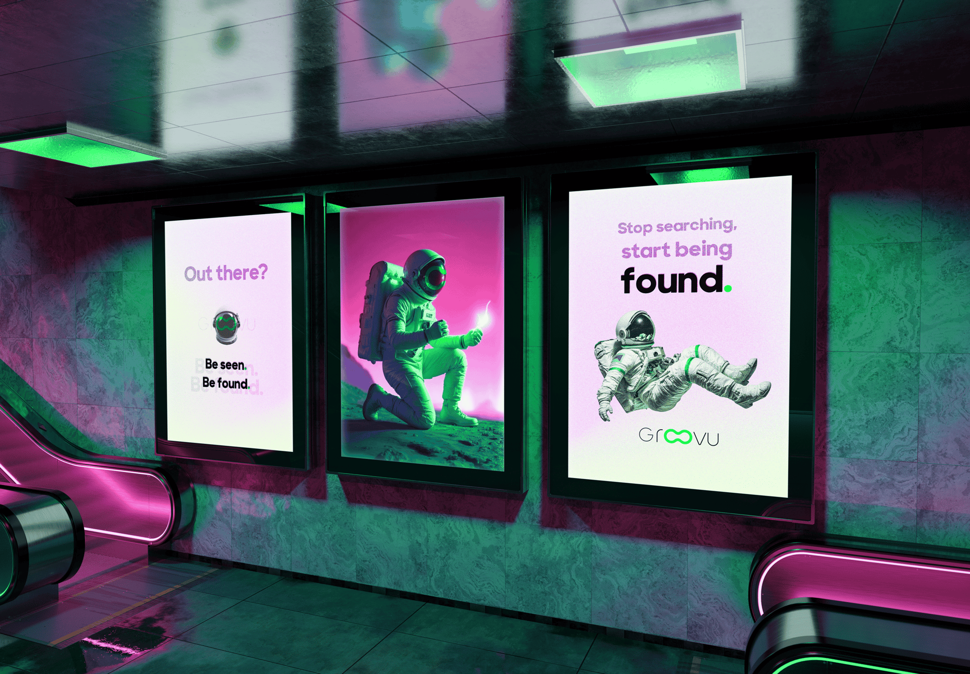
We developed a comprehensive brand strategy focused on clarity and authenticity. By creating a distinctive visual identity anchored by the unique eyeglasses motif in the logo, we highlighted Groovu’s commitment to enhancing digital visibility and insight. We built a flexible brand framework to accommodate future growth, allowing Groovu to introduce sub-brands seamlessly. The brand language and messaging emphasized Groovu’s modern, approachable personality and their mission to demystify SEO for their clients.
Result
The new brand identity successfully positioned Groovu as a fresh and credible leader in the SEO space. Early feedback from clients and industry partners praised the clarity and human touch of the brand, helping Groovu gain traction quickly. The adaptable logo and visual system have supported smooth expansion into new service lines, reinforcing Groovu’s market presence and fostering trust among a growing client base. Ultimately, the branding laid a strong foundation for Groovu’s long-term growth and innovation in digital marketing.
Challenge
Groovu faced the challenge of entering a highly competitive SEO market dominated by established players. Their core difficulty was to establish a brand identity that would communicate their innovative, transparent, and human-centered approach, differentiating them from more technical or impersonal competitors. Additionally, Groovu needed a scalable visual system that could grow with their expanding services while maintaining a consistent and memorable brand presence.
Solution
We developed a comprehensive brand strategy focused on clarity and authenticity. By creating a distinctive visual identity anchored by the unique eyeglasses motif in the logo, we highlighted Groovu’s commitment to enhancing digital visibility and insight. We built a flexible brand framework to accommodate future growth, allowing Groovu to introduce sub-brands seamlessly. The brand language and messaging emphasized Groovu’s modern, approachable personality and their mission to demystify SEO for their clients.
Result
The new brand identity successfully positioned Groovu as a fresh and credible leader in the SEO space. Early feedback from clients and industry partners praised the clarity and human touch of the brand, helping Groovu gain traction quickly. The adaptable logo and visual system have supported smooth expansion into new service lines, reinforcing Groovu’s market presence and fostering trust among a growing client base. Ultimately, the branding laid a strong foundation for Groovu’s long-term growth and innovation in digital marketing.
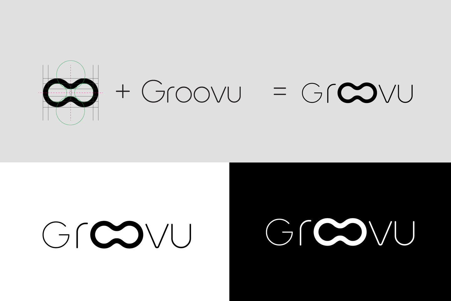
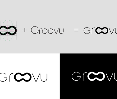
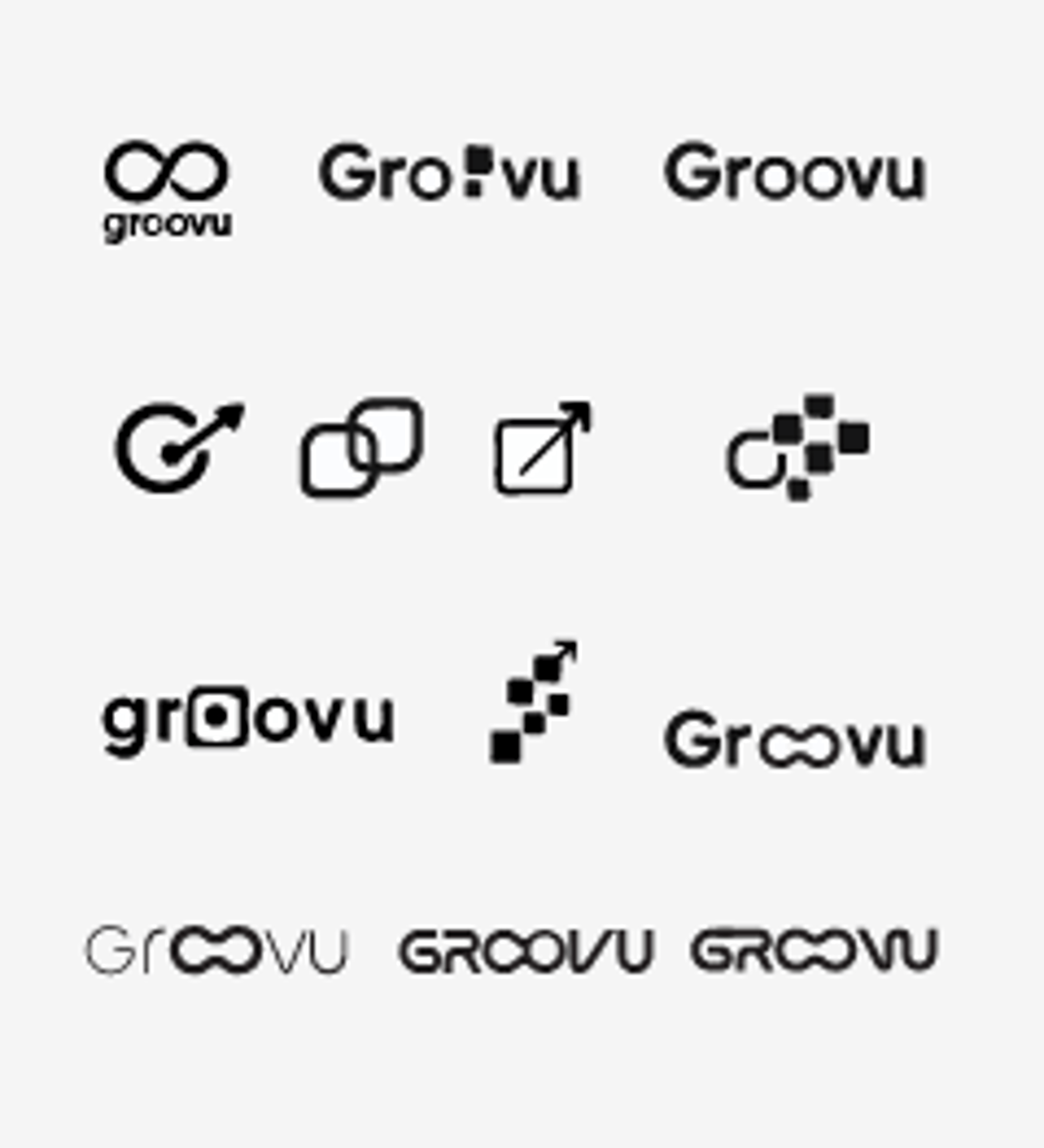
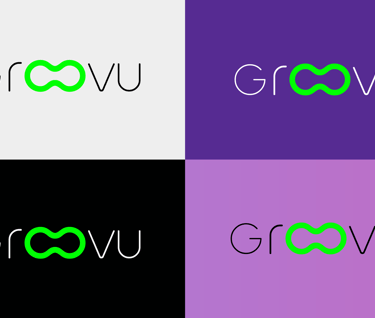
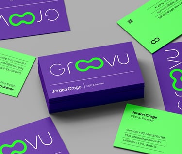
Logo Construction
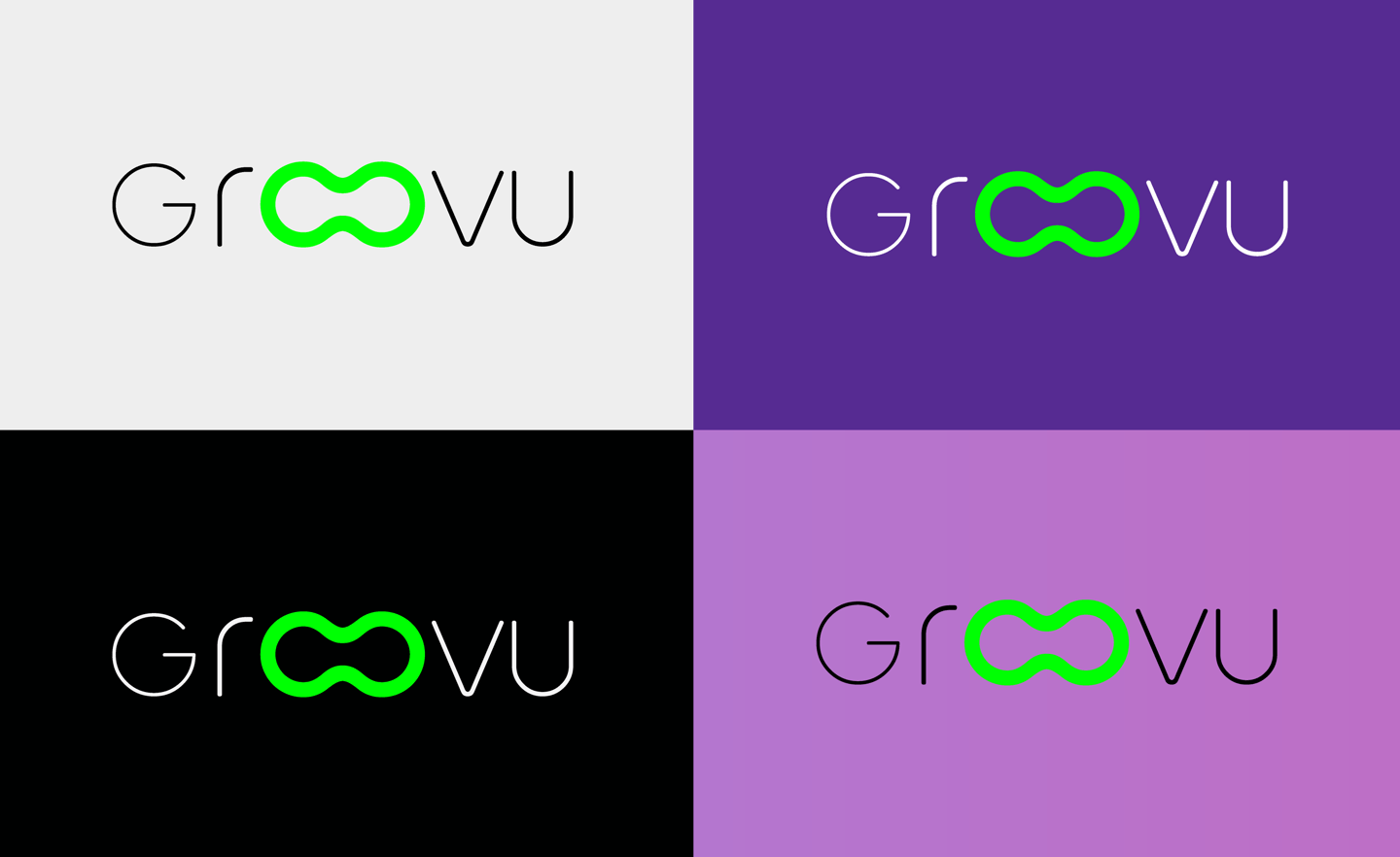
Final Logo (Black / White)

Logo Construction
Final Logo (Black / White)
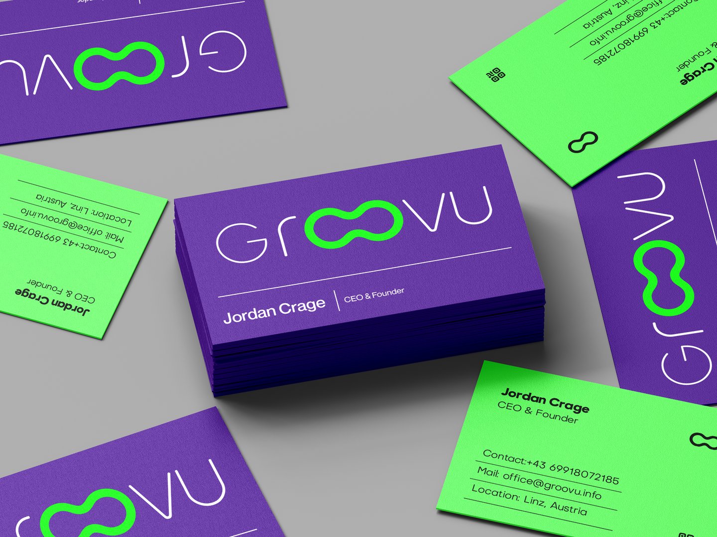
Brand Strategy and Framework


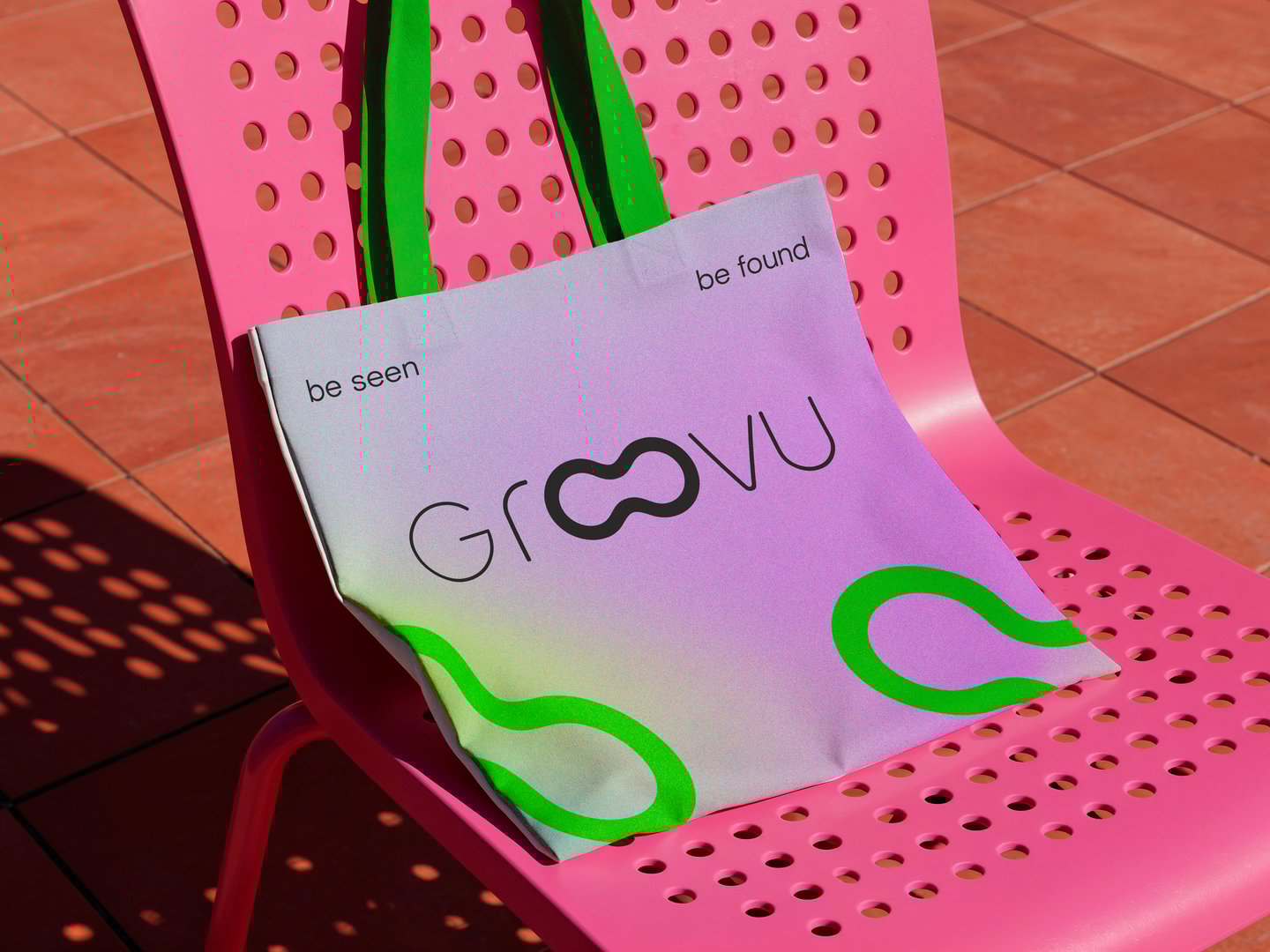
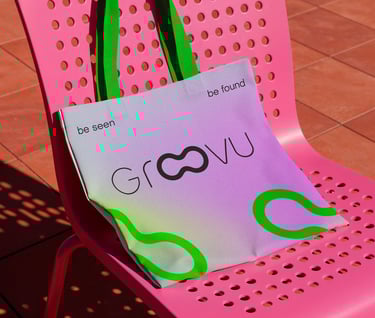
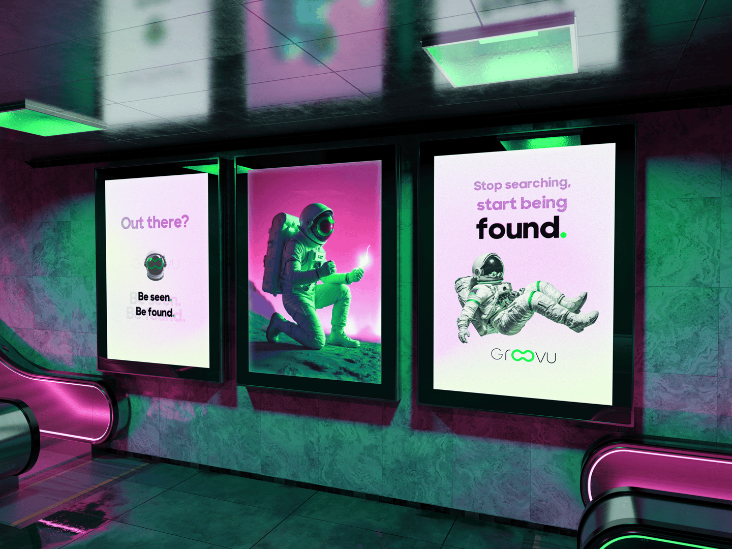
Groovu’s primary logo thoughtfully incorporates a distinctive design element:
The dual “O” characters are merged to form a subtle representation of eyeglasses.
This visual metaphor underscores Groovu’s commitment
to enhancing visibility and clarity within the digital landscape, reflecting the company’s focus on enabling businesses to navigate and succeed in the complex world of SEO.
This adaptable logo framework also supports the introduction of future sub-brands or service lines, ensuring a consistent and cohesive visual identity across the Groovu brand as it evolves.
To extend the brand hierarchy visually and strengthen the overall brand system,

#bd6fc6
#000101
#00ff03
#fb26f6
#562b92


Typography
Zacbel_X is Groovu's lead display type. Zacbel_X is inspired by broad nib lettering so it has a human-like quality, but also showcases modern serif treatments.
Shaping the Vision
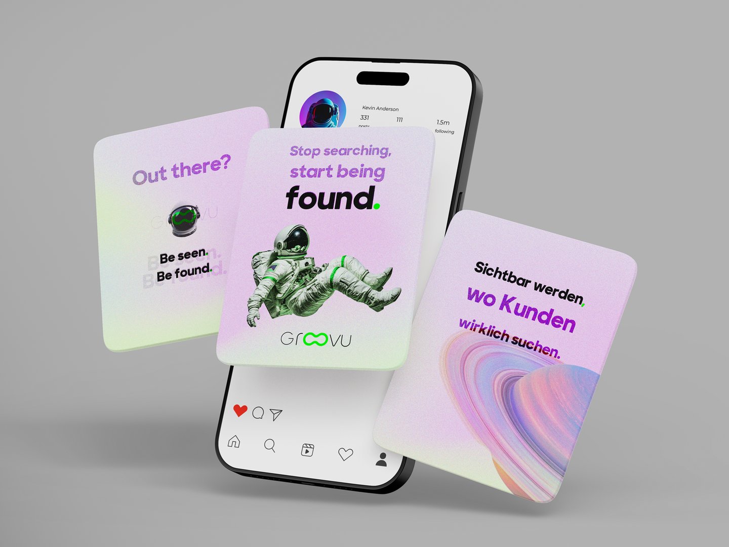
Groovu asks, “What does the digital world look like when businesses are empowered to grow through clarity, not complexity?” They're committed to helping companies cut through the noise of ever-changing algorithms and fragmented strategies—making SEO feel less like a mystery and more like a catalyst for sustainable growth. Groovu is tech-forward, yet deeply human.
We knew we needed to craft a brand for Groovu that reflected their core attributes: insightful, modern, and authentic.
Brand Strategy and Framework

Groovu’s primary logo thoughtfully incorporates a distinctive design element:
The dual “O” characters are merged to form a subtle representation of eyeglasses.
This visual metaphor underscores Groovu’s commitment
to enhancing visibility and clarity within the digital landscape, reflecting the company’s focus on enabling businesses to navigate and succeed in the complex world of SEO.
This adaptable logo framework also supports the introduction of future sub-brands or service lines, ensuring a consistent and cohesive visual identity across the Groovu brand as it evolves.
To extend the brand hierarchy visually and strengthen the overall brand system,

#bd6fc6
#000101
#00ff03
#fb26f6
#562b92
Final Logo (Black / White)
Typography
Zacbel_X is Groovu's lead display type. Zacbel_X is inspired by broad nib lettering so it has a human-like quality, but also showcases modern serif treatments.
Shaping the Vision
Groovu asks, “What does the digital world look like when businesses are empowered to grow through clarity, not complexity?” They're committed to helping companies cut through the noise of ever-changing algorithms and fragmented strategies—making SEO feel less like a mystery and more like a catalyst for sustainable growth. Groovu is tech-forward, yet deeply human.
We knew we needed to craft a brand for Groovu that reflected their core attributes: insightful, modern, and authentic.
Address
Blütenstraße 23
4040 Linz, Austria
Contact
info@henu.at
Transform your ideas into stunning visuals.

