
Branding Case Study
Pschola is the innovative tutoring app that makes education accessible through state-of-the-art technology. The brand stands for the promise of supporting parents in their search for qualified teachers through a user-friendly platform and maximum transparency. With a clear focus on educational excellence, Pschola creates a bridge between academic requirements and individual support. The concept makes the learning process more efficient and enables families to integrate ideal educational support as a permanent part of their daily lives, unlocking the full potential of their children.
Services
Brand Strategy - Visual Identity


Pschola
Branding Case Study
Brand Strategy - Visual Identity
Pschola is the innovative tutoring app that makes education accessible through state-of-the-art technology. The brand stands for the promise of supporting parents in their search for qualified teachers through a user-friendly platform and maximum transparency. With a clear focus on educational excellence, Pschola creates a bridge between academic requirements and individual support. The concept makes the learning process more efficient and enables families to integrate ideal educational support as a permanent part of their daily lives, unlocking the full potential of their children.
Pschola – at the core of the 'Find Your Teacher' vision – is an innovative tutoring platform revolutionizing access to quality education. The brand stands for the mission of seamlessly connecting parents and teachers while providing a flexible, high-quality learning environment for students from kindergarten through 12th grade.
Through comprehensive profiles, intelligent search filters, and a secure communication structure, Pschola simplifies the selection of the ideal teacher and actively supports the educational journey of the next generation. With a modern brand identity that combines trust and user-friendliness, Pschola positions itself as an indispensable companion for first-class educational support.


2024
Tutoring-Application
Brand Attributes:
Empowerment
Accessible
Innovative
Human-centric
Trustworthy
Visual Development
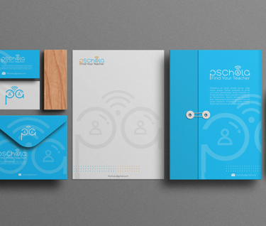
The visual identity of Pschola was developed to bridge the gap between technological innovation and human interaction. The logo design is a deliberate composition of connectivity and personal guidance, immediately conveying the platform’s core – the transfer of knowledge through qualified teachers.
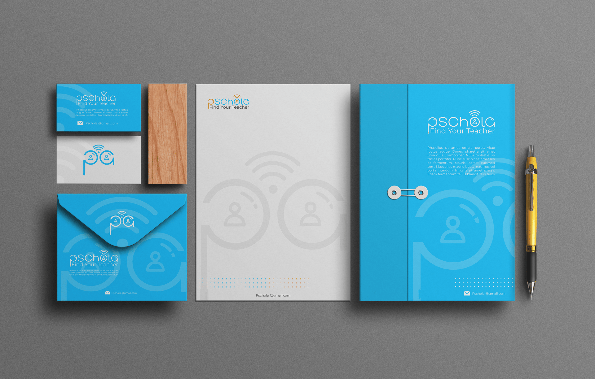
A central element of the wordmark is the integration of functional symbols: a subtly incorporated Wi-Fi signal symbolizes digital accessibility and location-independent access to education. This is complemented by an abstract user symbol within the letter 'o', representing a person's head and torso. This symbiosis clarifies that behind the technological platform, the human being – the teacher and the student – always remains at the center. The clean lines and modern typography underscore Pschola’s commitment to professionalism, trust, and a future-oriented educational culture.
Colour Palette
The Pschola palette consists of a base in Vivid Sky Blue (#24C6FF) (trust, digital innovation) and the vibrant accent color Soft Amber (#F79E34). This combination signals the symbiosis of technological precision and human warmth (reflecting the connection between the app and the teacher itself) and positions Pschola as a brand that is both professional (base) and simultaneously welcoming and motivating (accent).
Pschola – at the core of the 'Find Your Teacher' vision – is an innovative tutoring platform revolutionizing access to quality education. The brand stands for the mission of seamlessly connecting parents and teachers while providing a flexible, high-quality learning environment for students from kindergarten through 12th grade.
Through comprehensive profiles, intelligent search filters, and a secure communication structure, Pschola simplifies the selection of the ideal teacher and actively supports the educational journey of the next generation. With a modern brand identity that combines trust and user-friendliness, Pschola positions itself as an indispensable companion for first-class educational support.


2024 - Tutoring Application
Brand Attributes:
Empowerment – Accessible – Innovative – Human-centric - Trustworthy
Visual Development
The visual identity of Pschola was developed to bridge the gap between technological innovation and human interaction. The logo design is a deliberate composition of connectivity and personal guidance, immediately conveying the platform’s core – the transfer of knowledge through qualified teachers.
A central element of the wordmark is the integration of functional symbols: a subtly incorporated Wi-Fi signal symbolizes digital accessibility and location-independent access to education. This is complemented by an abstract user symbol within the letter 'o', representing a person's head and torso. This symbiosis clarifies that behind the technological platform, the human being – the teacher and the student – always remains at the center. The clean lines and modern typography underscore Pschola’s commitment to professionalism, trust, and a future-oriented educational culture.


Colour Palette
The Pschola palette consists of a base in Vivid Sky Blue (#24C6FF) (trust, digital innovation) and the vibrant accent color Soft Amber (#F79E34). This combination signals the symbiosis of technological precision and human warmth (reflecting the connection between the app and the teacher itself) and positions Pschola as a brand that is both professional (base) and simultaneously welcoming and motivating (accent).
#F79E34
#24C6FF
Pschola – im Kern der Vision „Find Your Teacher“ – ist eine innovative Nachhilfe-Plattform, die den Zugang zu qualifizierter Bildung revolutioniert. Die Marke steht für die Mission, Eltern und Lehrkräfte nahtlos miteinander zu verbinden und Schülern vom Kindergarten bis zur 12. Klasse eine flexible, hochwertige Lernumgebung zu ermöglichen.
Durch umfassende Profile, intelligente Suchfilter und eine sichere Kommunikationsstruktur erleichtert Pschola die Auswahl des idealen Lehrers und fördert aktiv die Bildungsreise der nächsten Generation. Mit einer modernen Markenidentität, die Vertrauen und Benutzerfreundlichkeit vereint, positioniert sich Pschola als unverzichtbarer Begleiter für erstklassige Bildungsunterstützung.


2024 - Nachhilfe-Applikation
Markenattribute:
Empowerment – Barrierefrei – Innovativ – Menschlich - Vertrauenswürdig
Visuelle Entwicklung
Die visuelle Identität von Pschola wurde entwickelt, um die Brücke zwischen technologischer Innovation und menschlicher Interaktion zu schlagen. Das Logo-Design ist eine bewusste Komposition aus Konnektivität und persönlicher Begleitung, was den Kern der Plattform – die Vermittlung von Wissen durch qualifizierte Lehrkräfte – unmittelbar transportiert.
Zentrales Element der Wortmarke ist die Integration funktionaler Symbole: Ein subtil eingearbeitetes Wifi-Signal symbolisiert die digitale Erreichbarkeit und den ortsunabhängigen Zugang zu Bildung. Dieses wird durch ein abstraktes User-Symbol im Buchstaben „o“ ergänzt, welches Kopf und Oberkörper einer Person darstellt. Diese Symbiose verdeutlicht, dass hinter der technologischen Plattform stets der Mensch – der Lehrer und der Schüler – im Mittelpunkt steht. Die klare Linienführung und die moderne Typographie unterstreichen Pscholas Anspruch auf Professionalität, Vertrauen und eine zukunftsorientierte Bildungskultur.


Farbpalette
Die Pschola-Palette besteht aus einer Basis in Vivid Sky Blue (#24C6FF) (Vertrauen, digitale Innovation) und der leuchtenden Akzentfarbe Soft Amber (#F79E34). Diese Kombination signalisiert die Symbiose aus technologischer Präzision und menschlicher Wärme (wie die Verbindung von App und Lehrer selbst) und positioniert Pschola als eine Marke, die professionell (Basis) und gleichzeitig einladend motivierend (Akzent) ist.
#F79E34
#24C6FF
Challenge
Pschola faced the task of establishing an innovative digital solution in the educational sector that breaks down the barriers between parents and qualified teachers. The goal was to create a brand that sells more than just an app—it sells a sense of security rooted in trust and academic progress. The challenge lay in translating educational excellence and user-friendliness into a visual identity that stands out clearly from the traditional, often outdated tutoring market, positioning Pschola as a pioneer for modern, digital learning.
Solution
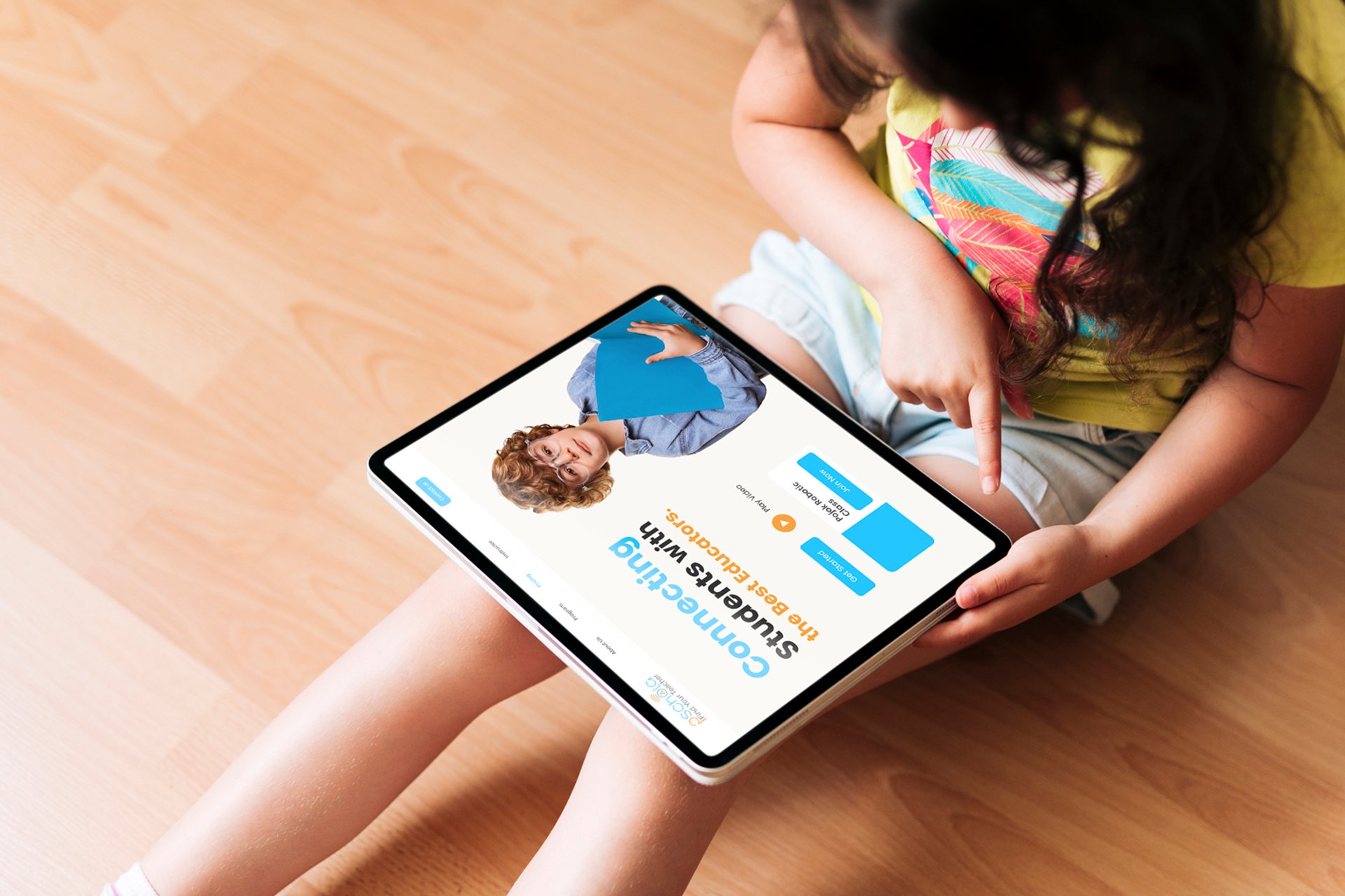
We developed a comprehensive brand strategy focused on clarity and authenticity. By creating a distinctive visual identity, led by a modern logo design and a vibrant color palette, we highlighted Pschola’s commitment to high-quality education and technological innovation. This targeted design language deliberately breaks away from bureaucratic conventions and reflects the dynamic, future-oriented development of digital learning. We built a flexible brand system that facilitates future growth, allowing Pschola to seamlessly introduce sub-brands or new learning modules for various age groups.
Result
The new brand identity successfully positions Pschola as a leading destination for digital education. The brand communication emphasizes Pschola’s modern, accessible personality and its mission to make the educational market transparent and understandable for parents. Consistent visual implementation ensures clear differentiation from competitors and sustainably strengthens the brand message. This cohesive system has built the foundation for high brand awareness and a loyal community that perceives Pschola as the premier choice for inspiring, holistic educational experiences.




Address
Blütenstraße 23
4040 Linz, Austria
Contact
info@henu.at
Transform your ideas into stunning visuals.


